

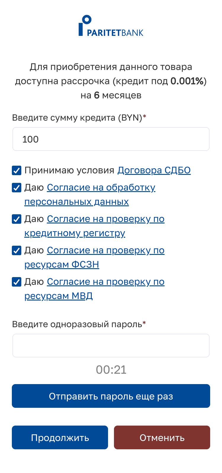
Functional but not usable micro-fin app
I redesigned a micro-financing app enabling in-store loan applications without bank clerk assistance. The developer-built MVP validated functionality but lacked usability - unclear flows, missing feedback, and excessive legal complexity reduced conversion potential.
This redesign was part of a larger initiative, including B2B tools for shop administrators and a delivery partner platform, aimed at improving efficiency and customer self-service.
Impact & result
Impact & Results
Clearer user flows cut application time from days to about 10 minutes.
Simplified legal complexity led to 30k+ conversions in 9 months.
Independent loan applications enable small businesses ( SMBs ) to offer in-store financing without bank clerks.
Market
Eastern Europe
My Role
UX and UI redesign
Usability testing
Timeline
3 months, 2024
Team
Project Manager
Business Analytic
Project Owner
3 developers
When unexpected expenses become a test of trust
Imagine your fridge breaks down. To replace it, you need a loan. Instead of a quick digital process, you need to fill up loan application forms in the shop (not any, just the one that has bank assistant at hand), then in person visit a bank hoping to get financing.
Quick market insight clarified user's motivation & business goal
65.6% of households
rely on consumer loans to manage their budgets
11% avoid borrowing
as the process is intimidating, people often feel uncomfortable discussing personal finances in stores.
Extra costs for shops
Bank clerks are paid to help fill out loan forms in larger shops. Small shops (SMBs) cannot afford such support.
With no budget for usability testing, I needed a way to uncover real usability issues without direct user feedback. I conducted stakeholder interviews (project owner, PM, business analyst, and developers) and a heuristic evaluation against usability and accessibility standards.
Heuristic analyses to uncover critical UX issues

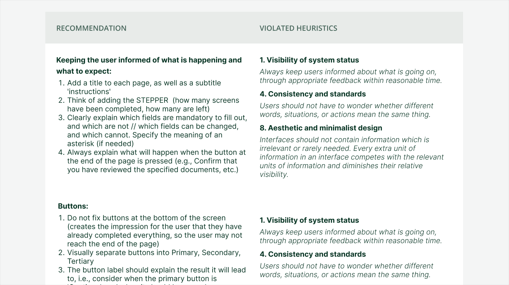
Key areas for improvement
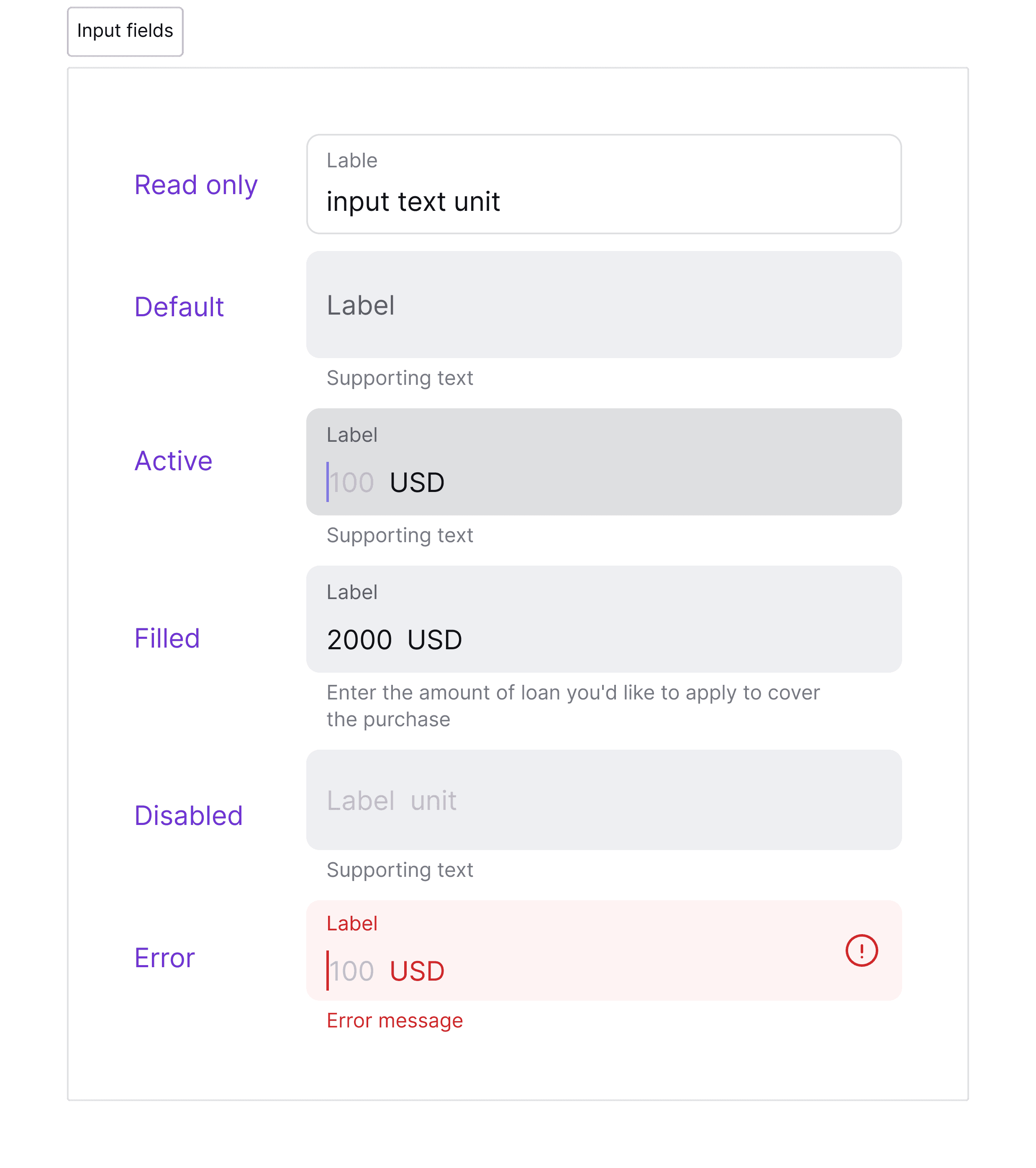
Apply core UI/UX principles
— to enhance usability and visual consistency
01
Clarify user progress
— to navigate the user in the loan application flow
02
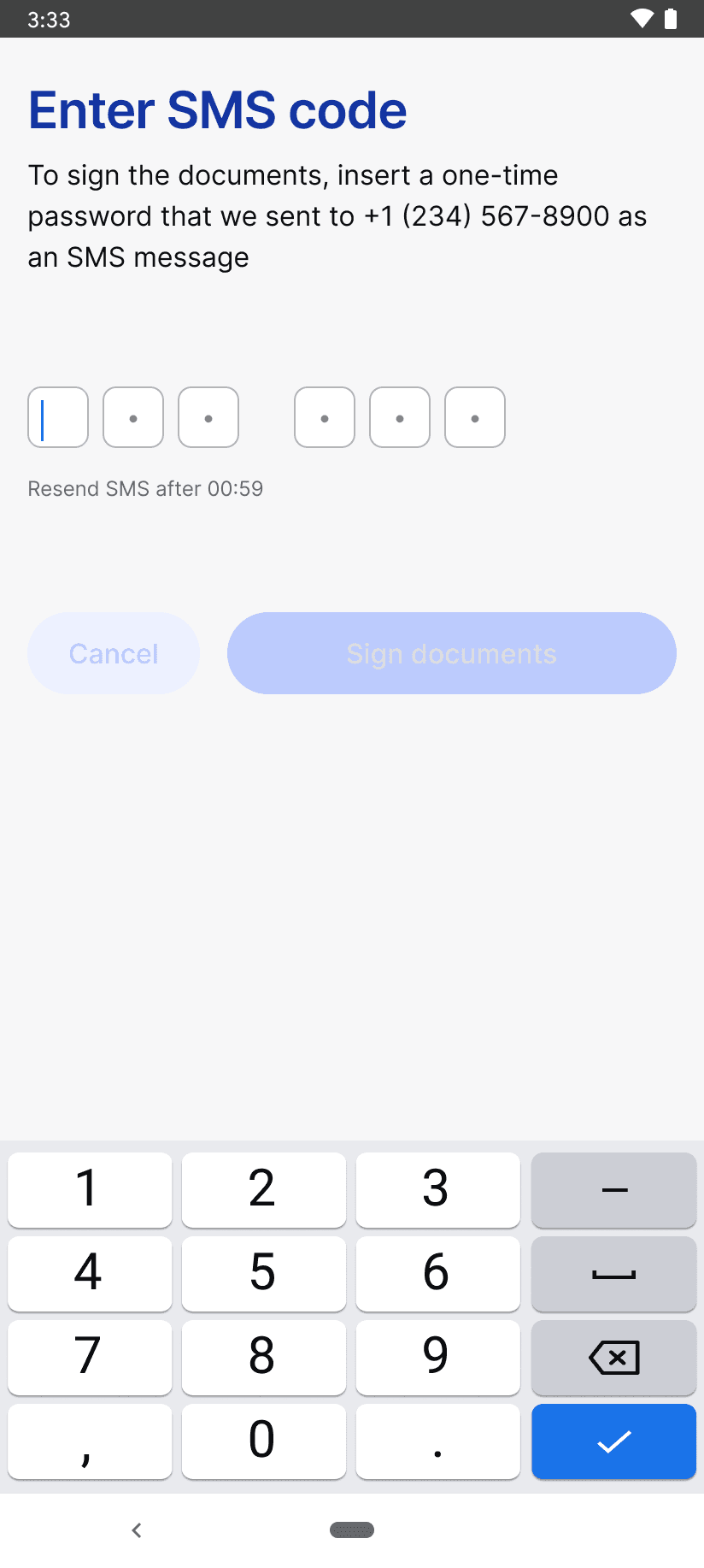
Streamline forms
— to support smooth completion
03
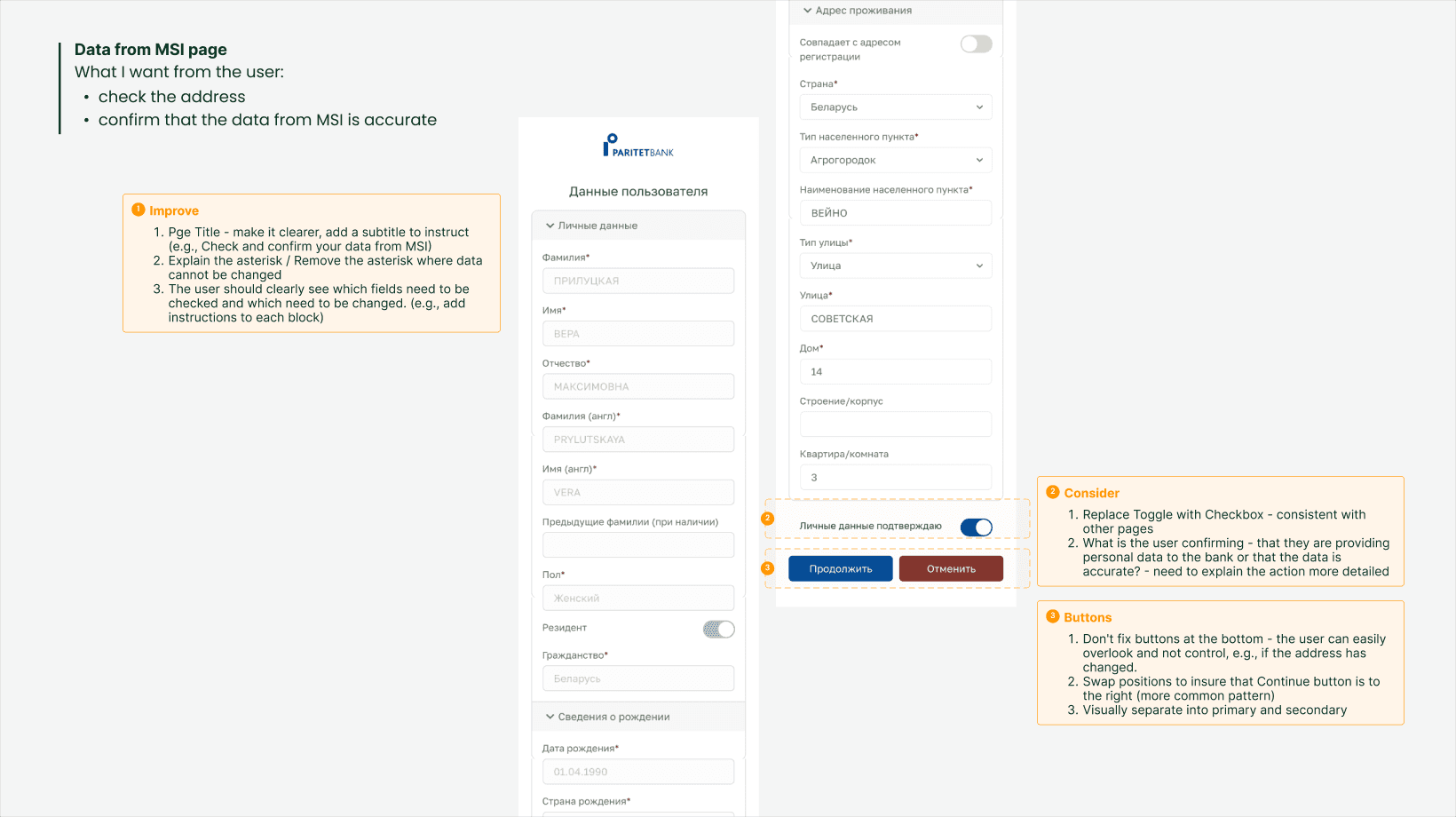
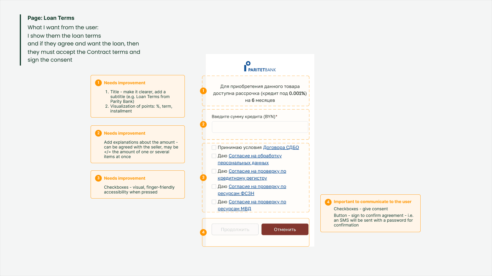
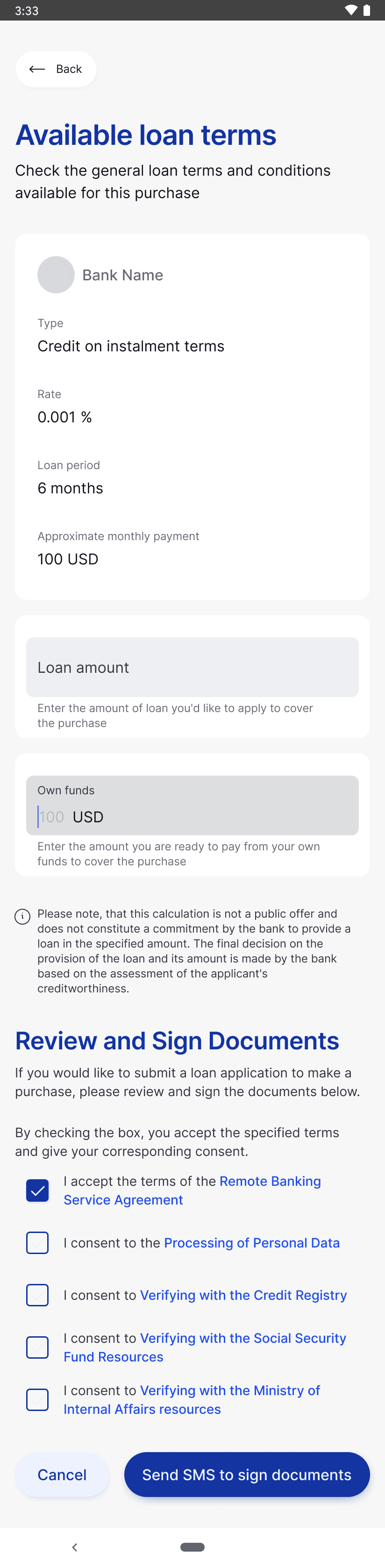
Minimise legal jargon
— use plain language wherever possible
04
Reduce cognitive load
— limit actions per screen
05
Clarify legal documents
— explaining names and abbreviations in context
06
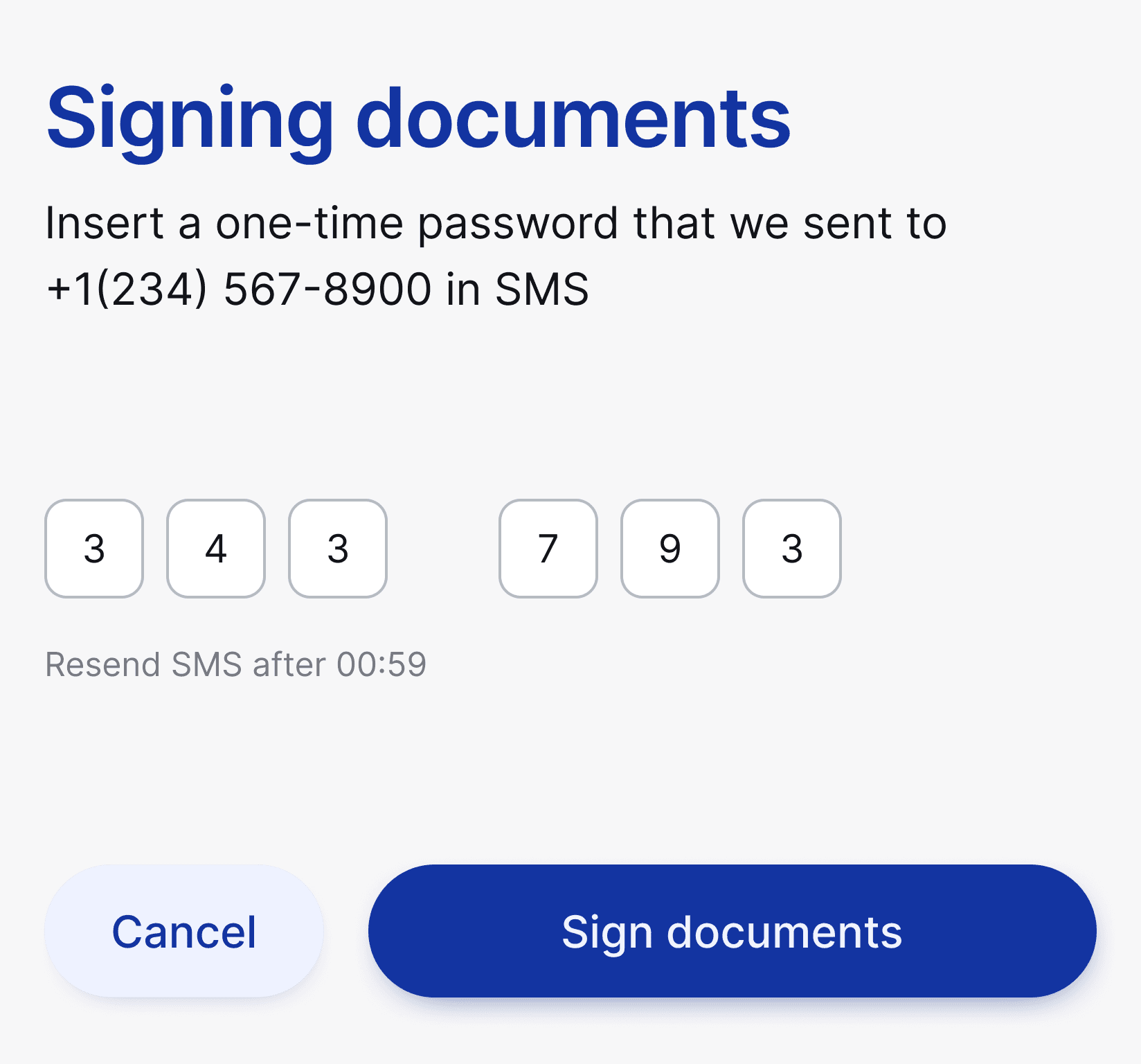
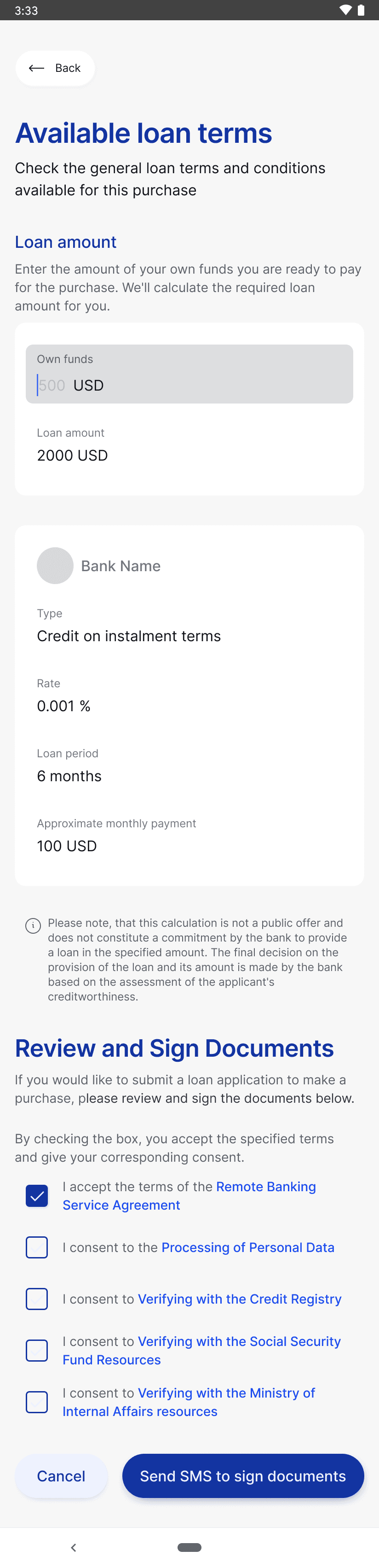
Designing for clarity and confidence
The goal was to make every step clear and predictable.
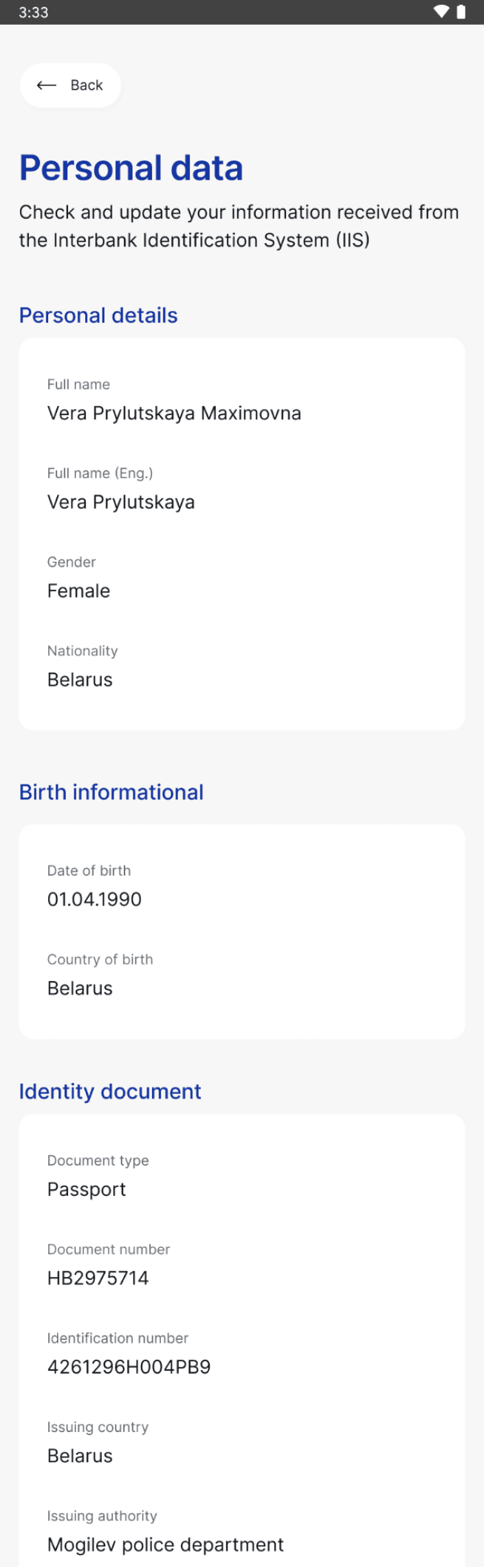
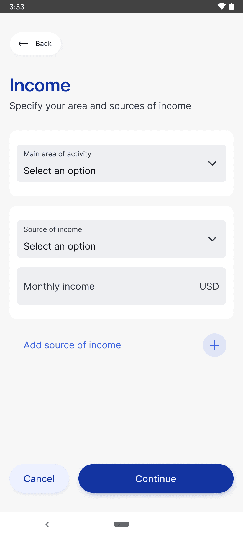
I restructured the layout, grouped related questions, and added contextual hints so users always knew why we were asking for information.
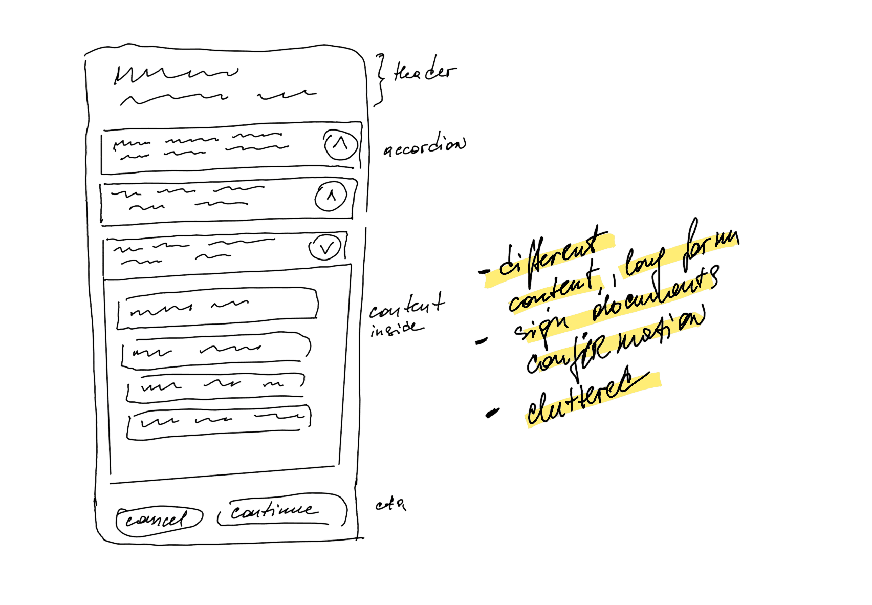
Layout exploration
To find the best way to handle legal complexity, I've sketched multiple layouts.
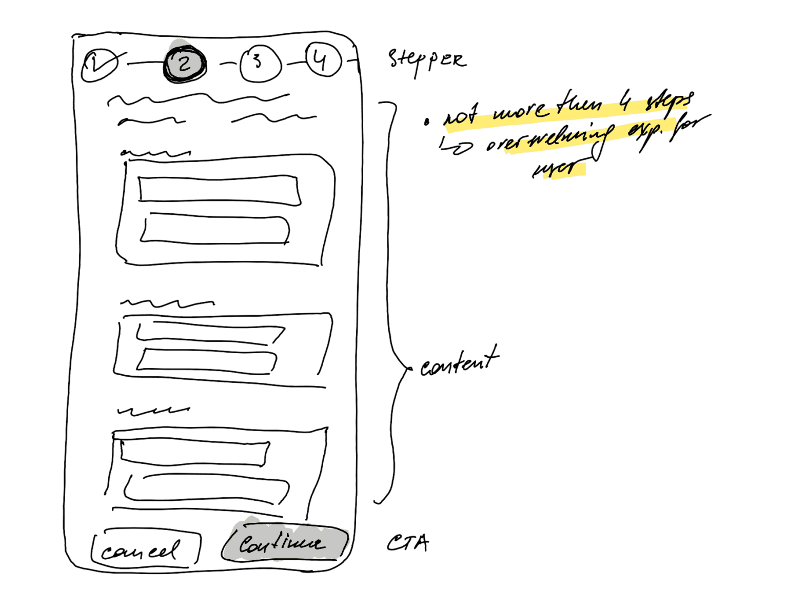
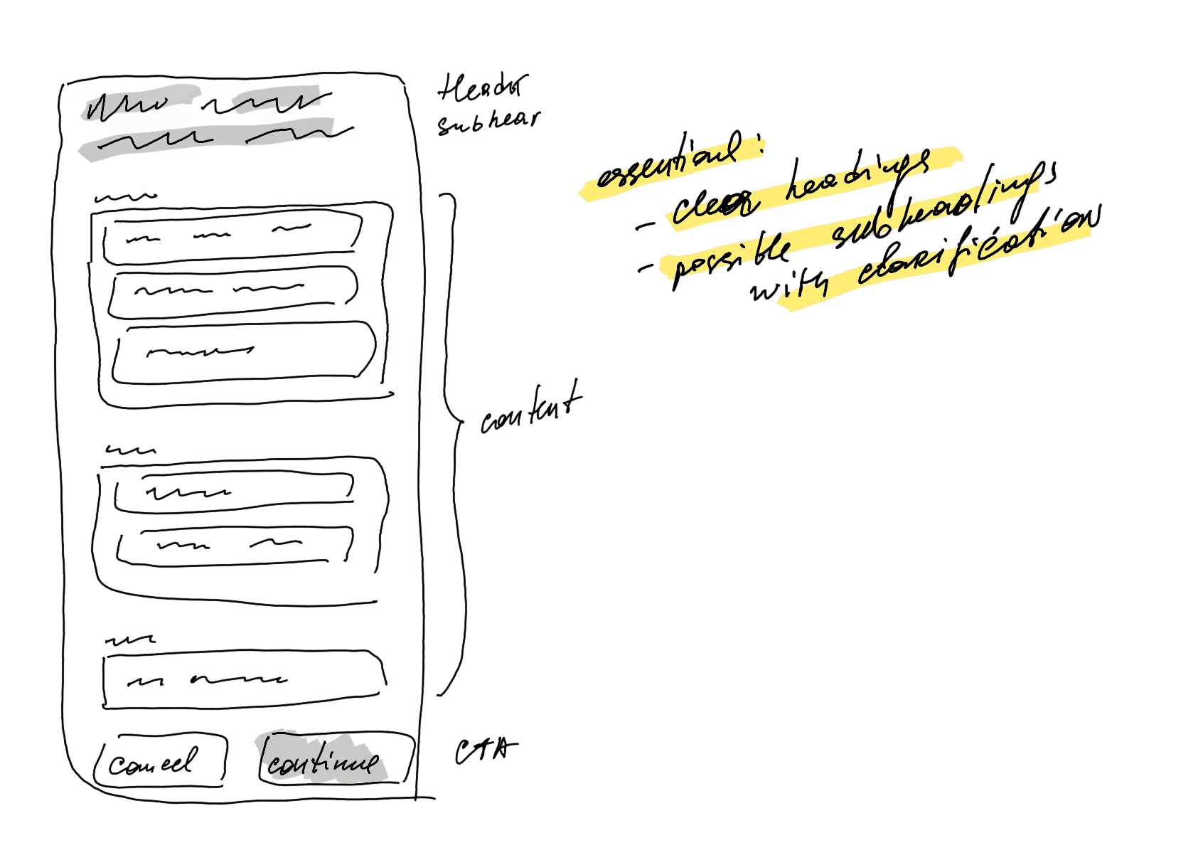
Final solution:
Adding clear single focus to the page
To create intuitive flow without visual overload, I decided to stick with headlines supported by small hints to explain why each piece of data was needed.
Reducing cognitive load
Complexity wasn’t just in the number of fields, but also in how they appeared. I removed visual distractions, reordered steps into a natural sequence, and gave each screen a clear single focus.
What users really needed to see but couldn’t find
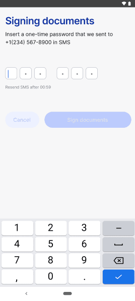
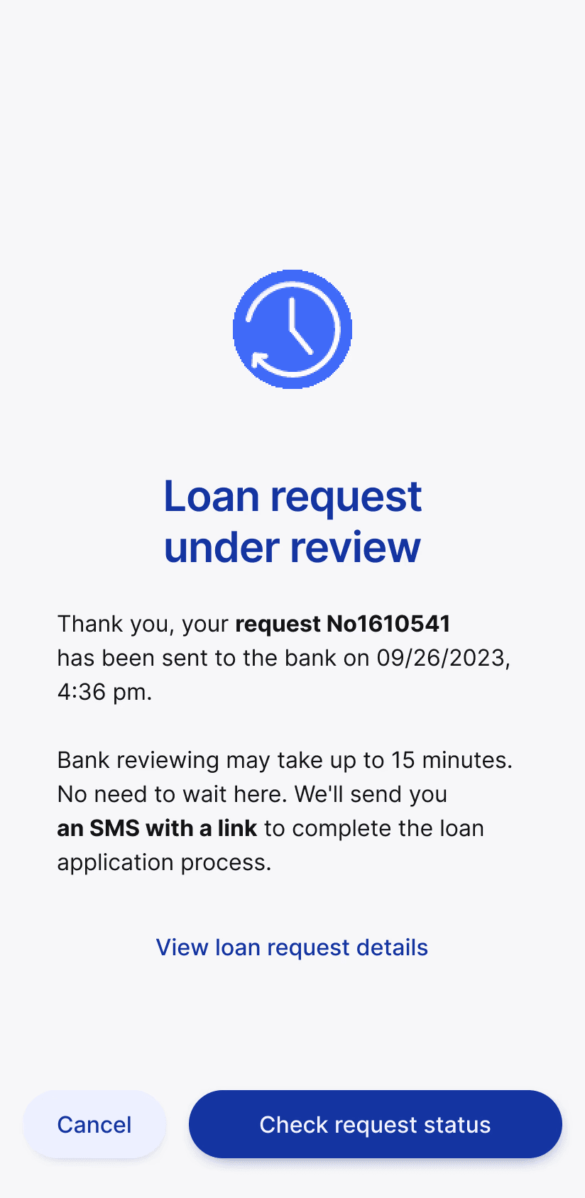
To see how the users would manage to apply for a loan with the new design, I conducted moderated usability testing. Overall, all users completed the assigned tasks, but the testing revealed confusing flows and areas that remained unclear.
“
Shall I pay the whole amount in 6 months?
I'm not ready to finish before I have any documents to confirm my purchase and the credit.
Well, now I'm not quite sure where to find final loan conditions?
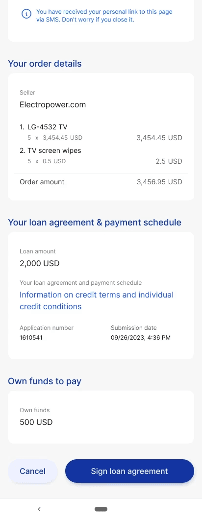
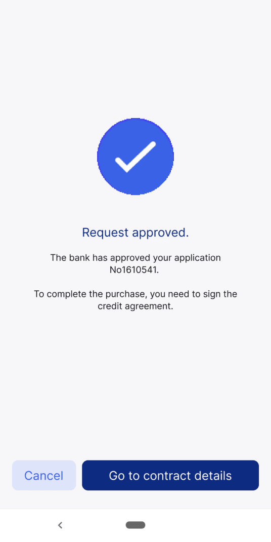
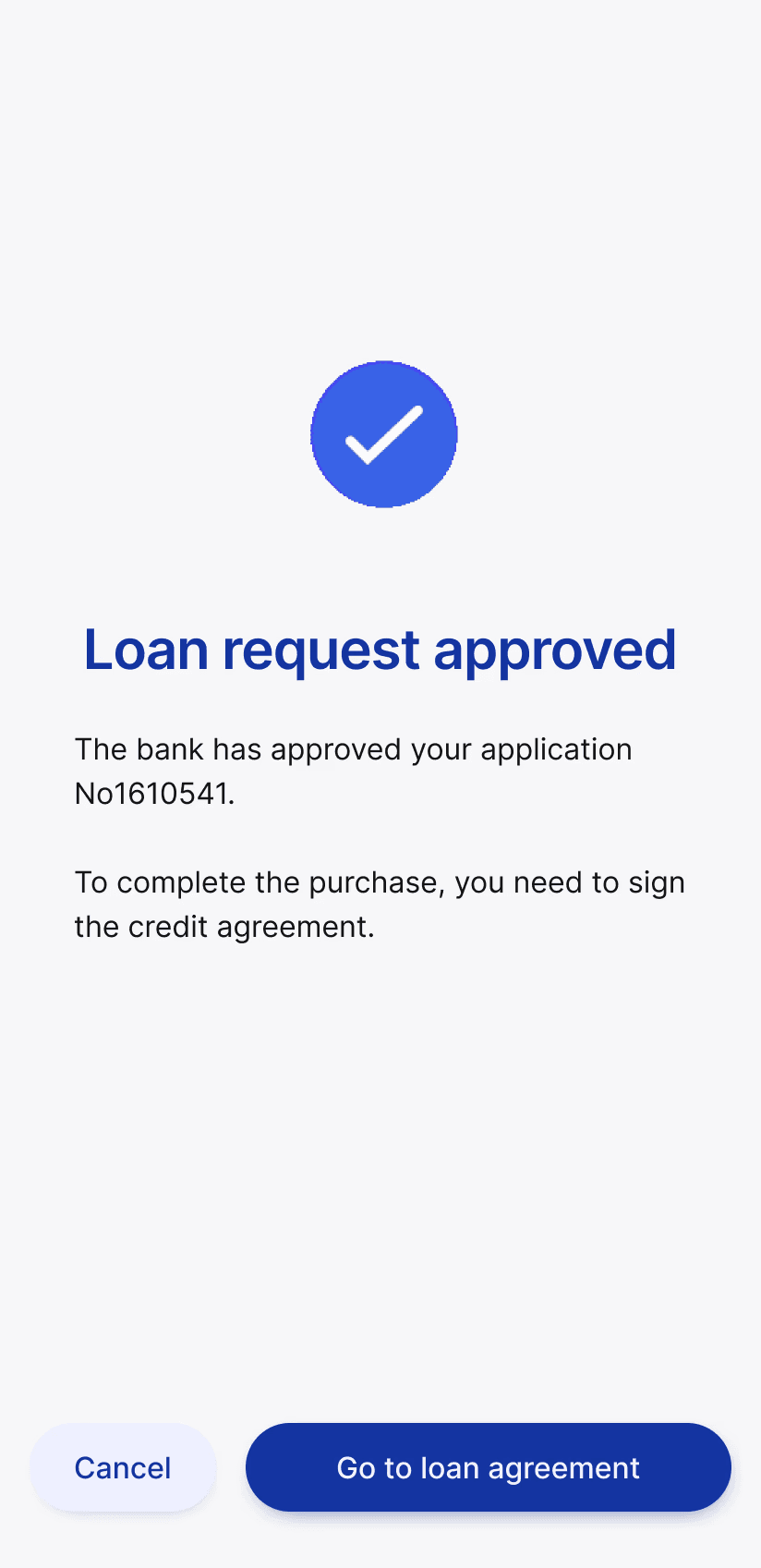
Installment payments
Before

Solution

Loan agreement
Before
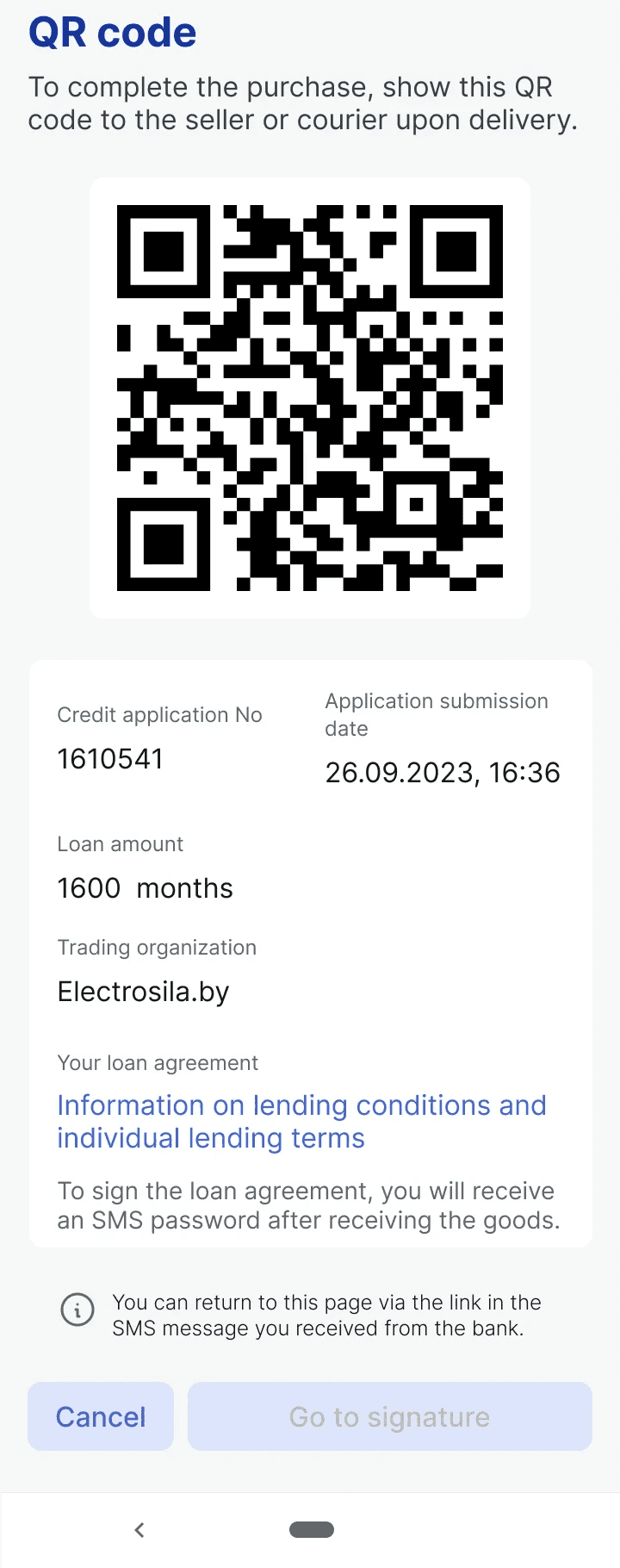
Solution
“
Oh, where am I now?
And I would think: As always. Why did I start with it?
Oh, it's confusing. What will happen when I push Cancel?
Initial flow
Screen 1
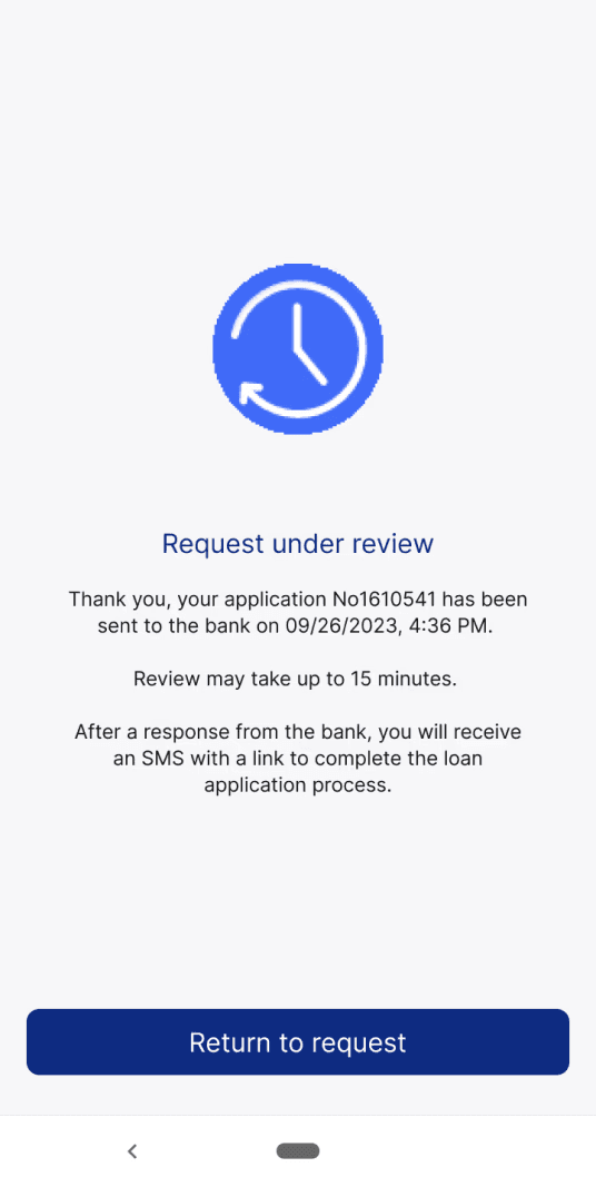
Screen 2
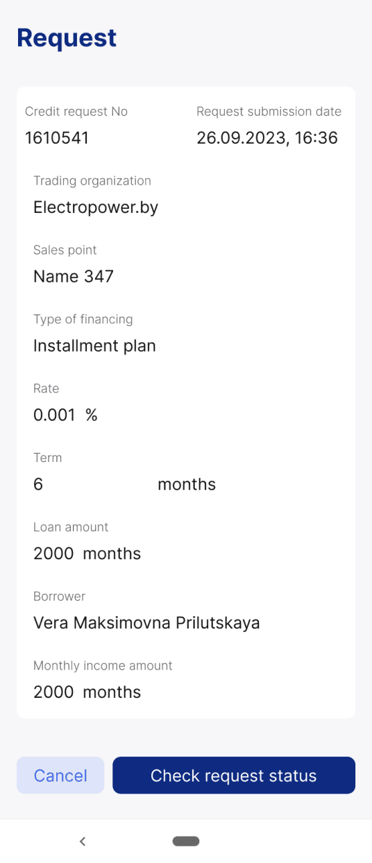
Refined flow
Screen 1
Screen 2

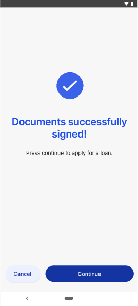
Cut loan application time from days to minutes
< 10 mins
completion time
Customers applied for loans directly in-store, with no bank clerk involvement.
30k+
conversions
Reached ~1% share of national consumer loans in the first 9 months.
"Alesia! Thanks to you, our app has broken all records for processing time.
Just now, we received a loan application for a robot vacuum cleaner in 4 minutes, including bank approval."
- Michal, Project Owner
What I learned
Small UX fixes create huge value
The original design was created to test the app's functionality. That was a perfect case to see how thoughtful heuristics turned a frustrating flow into a smooth one.
Involve team you have to get more ideas
Being the only designer in the team, I set up open collaboration with the whole team of developers, PM, Business analytics and Project Owner, by asking their opinion, collaborative ideation and being open for their suggestions and feedback.
Feedback isn’t failure - it’s forward motion
When a user couldn’t find key information during testing, it felt like a setback, but it was a valuable reminder that usability issues are best caught early. Staying calm and open to feedback made the design stronger.
What's next
Next steps depend on the broader business strategy, like strengthening competitiveness, partnering with more banks, and SMBs. From a UX perspective, I see key opportunities in:
addressing edge cases and improving accessibility to ensure the product supports a wider range of user needs.
observing users in context to refine flows and adapt the experience to real-world scenarios.
simplifying legal language further so it remains clear, user-friendly, and trustworthy.
Other projects
FinTech
||
B2B
||
2024
Redesign of an internal tool to process and manage micro-financing
Reduced training and maintenance costs
